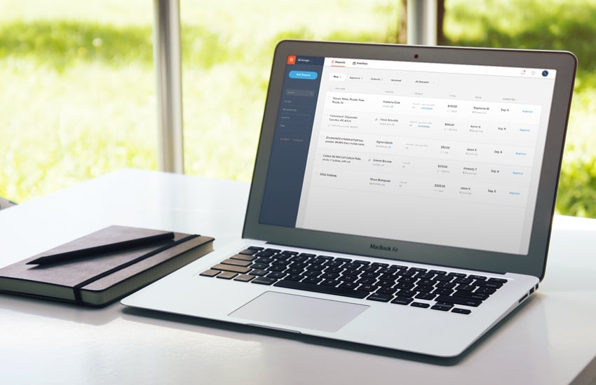
Quartzy launched six years ago with a seemingly simple yet highly ambitious mission: accelerate the pace of scientific discovery through a free platform that streamlines lab research. Since then, the company co-founded by Jayant Kulkarni (CEO) and Adam Regelmann (COO) has implemented iterative improvements and updates. But with nearly 300,000 worldwide users—many of whom log in daily—Quartzy knew the time had come for its most ambitious overhaul yet.
 Adam Regelmann
“We’ve always been a company focused on the long term, and that means providing scientists with tools that make their lives more efficient,” says Regelmann, who oversees product development. “We had collected a lot of user feedback over the years—thousands of tickets. And while we could have piecemealed things together and tacked on features, given our growth we decided to raise enough capital to enable us to comprehensively evaluate our status and overhaul both our design and technical frameworks in a way that will allow us to scale for years to come.”
According to Regelmann, Quartzy’s rebuilt information architecture is the foundation of this long-term commitment. “Previously, the web application functioned very well, but it was a little hard for new users to understand where everything was," Regelmann says. "In the updated design, it’s much easier. The overall layout is more intuitive. There’s this effortlessness you feel when using well-designed software. There’s a sense of calm that comes over you, and we really wanted to bring that into the new user experience.”
That relaxing user experience is the summation of many long, sometimes stressful, hours. The process began last July, as a product manager, two designers, and a design firm spent three months creating the new design and specs. “During that phase, we talked to dozens of active labs about what was working for them with the current web application, what wasn’t working, what they’d like to see, and how they used it. What features they did use and didn’t use,” Regelmann says.
 Andy Crum
Since October the focus has been engineering, design iteration, usability studies, and testing—lots of testing. Seven full-time engineers have invested about 7,000 hours of total work. “From a technical perspective, this was the most ambitious project we've ever undertaken,” says Quartzy Director of Engineering, Andy Crum. Usability studies either validated or invalidated assumptions made during the design phase, such as scientists’ initial reactions to the new design, where they would expect the activity path to take them next, and what they think just happened when they clicked something.
Quartzy dedicated two employees to full-time testing of every functional element. “It’s easy for bugs to come up in a product, and we wanted to ensure that once this was released, our users had the most seamless experience possible, so we put a lot of effort into testing,” Regelmann says. “Every click-through and page view has been tested. There are over 3,000 individual actions that our team manually tested—multiple times and in multiple browsers—many of which are also automatically tested by code every time a change is made.”
Those thousands of actions cohesively contribute to a major workflow facelift designed to serve users—especially lab managers—better than ever. “It’s very clear how requests move through the ordering process and what you, as an admin, need to do next,” Regelmann says. “It makes it very obvious that you have items to process if you’re the person who processes them; that you have items to approve if you’re the person who approves them.”
 Filtering has been brought to the forefront to become more readily apparent.
A longtime Quartzy feature, filtering has been brought to the platform’s forefront to make it more readily apparent and universally beneficial. “That will save researchers time when finding and reordering the stuff they need,” Regelmann says. “Filtering is very powerful, allowing you to quickly narrow down your to-do list and see only the things you need to.”
All current data and features remain, and the updated Quartzy surfaces and improves features that add the most value. Technical improvements have already made the platform 26 percent faster, and there are more performance improvements planned. The refresh began rolling out in late February, and all users now have access. Quartzy remains free and always will be.
Despite his confidence in the overhaul, Regelmann knows that Quartzy—like any software company relaunching its core product—still faces plenty of work to make current and future users as excited about the changes as he is. “New users will be pleasantly surprised, and current users will go through a small learning curve,” Regelmann says. “But we’ve done everything possible to accelerate the learning process and make this transition as smooth as possible. We have training webinars every day for anyone who wants to go through them, we’ve updated our support documentation, and our support team is super responsive by live chat or email.”
Quartzy is the world’s No. 1 lab management platform. We help scientists easily organize orders, manage inventory, and save money. We’re free and always will be. Visit Quartzy.com or reach out at info@quartzy.com.
Interested in writing for The Q? Send us an email!
Share this:

Greg Schindler
Greg has a BA from Stanford (English/Football) and MS from Oregon (Journalism). He's our Director of Marketing and Pastries.
