We’ve all heard it: “a picture is worth a thousand words”. This may be truer in the sciences than anywhere else. As a scientific illustrator, I’ve both studied the theory and witnessed the power of images as teaching tools, and have watched with delight as they’ve become an increasingly popular way of communicating research across the scientific community and beyond.
From graphical abstracts to conference presentations, images are everywhere in the sciences, and with good reason. Over the past few decades, tons of scientific and anecdotal evidence has surfaced suggesting that images are far superior to text and speech when it comes to communication and education. For example,
- Extensive research conducted by Richard Mayer (who some might call the “father of multimedia”) showing that optimal learning occurs when both text and visual materials are presented together1
- It’s been cited internet-wide that about 65% of the population are visual learners
- Our brain receives and processes more visual information than all other senses combined2
- Humans remember imagery much better than text: People recall 20% of what they read, 10%, and 80% of what they see and do3
- A study done at the University of Michigan showed that journal articles that are tweeted with visual abstracts get almost three times (3x) more reads than with text alone4
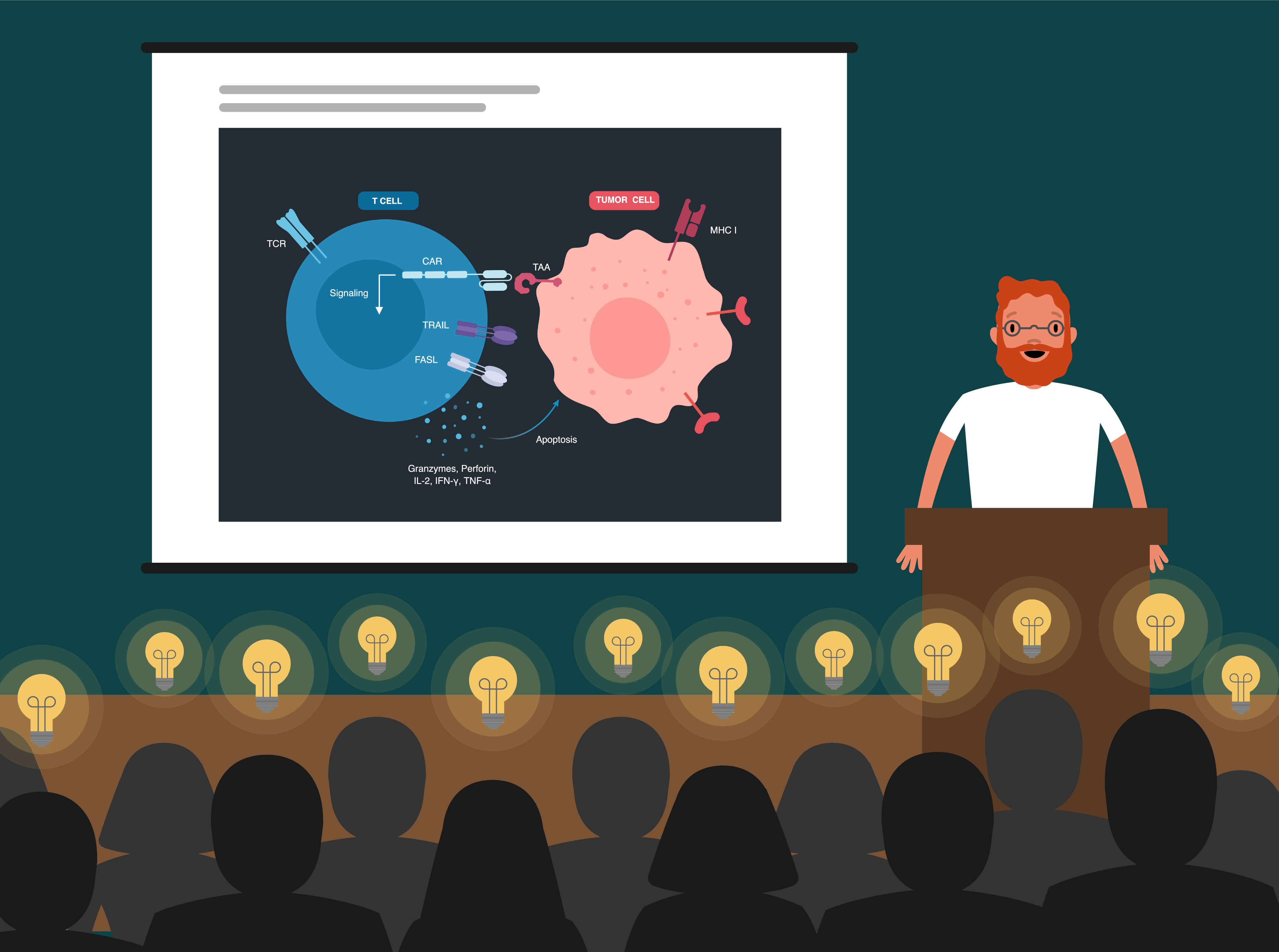
Yet, despite their popularity and proven efficacy, most science images out there are, at best, sub-par. Search through almost any issue of a relatively prominent scientific journal and you’ll see sophisticated scientific research accompanied by graphical abstracts rife with lop-sided cells, strange gradients and wacky colour combinations. Outdated styles aside, many of these images also fail to communicate the underlying scientific story effectively--a sad reality when you consider how much time, energy, and resources scientists dedicate toward unearthing that story.
Eight months ago, I joined the team at BioRender as a user researcher. Part of my job has been to speak with hundreds of scientists about the challenges they face in communicating their research through pictures. I’ve come to learn that most scientists face the same set of hurdles, many of which can be overcome with simple tools and strategies. As part of my mission with BioRender, I’ve taken it upon myself to elucidate these strategies, and in the spirit of science, I’d like to share my major findings...
Hurdle #1: “I’m not an artist.”
The first major issue at play is the fact that scientists rarely receive any formal training in visual communication. This means that researchers who want to improve in this area are forced to self-teach during their spare time (and let’s face it, “spare time” is a pretty foreign concept to most scientists).
Plus, even with training, making effective science visuals is hard. As somebody with years of training in visual science communication, I can attest to the fact that distilling a complex scientific concept into a simple and accessible figure is no easy feat.
Solution: Learn the basics.
Educate yourself on the basic design principles. You don’t need to go to art school to make effective images. As an illustrator, my own work improved tenfold simply by learning basic design principles and depending on a few “essential” resources:
- Here’s a great infographic to have open while you work on a figure to remind you of all the design factors at play in any successful image
- A quick-and-dirty summary of the Gestalt Principles, the rules of human visual perception.
- For a more in-depth overview of important design basics (maybe for the plane ride to your next conference?): The Non-Designer’s Design Book.
Remember the Golden Rule: Keep it Simple. This is my #1 tip to anyone trying to hone their SciComm skills: the most effective images say one thing and say it well. So, before you start, come up with a single message or story that your image will convey and show it in the simplest way possible. If you need to show multiple concepts, break it down into multiple figures.
Hurdle #2: “Making figures takes way too long”
After talking with so many researchers, one thing is clear: scientists are busy. I can’t tell you how many times I’ve had to schedule an interview with a researcher at 11pm simply because didn’t have another spare moment in their day. Outside of designing and carrying out experiments, applying for grants, writing publications, and preparing for conferences, scientists have little time to dedicate towards figures.
What’s more, most graphics softwares are often unintuitive and require a significant time commitment to learn. One scientist we met even took an entire week off of work to try and grasp the basics of Adobe Illustrator! These programs also require you to draw everything from scratch, which can make the process of building an image extremely time-consuming.
Most graphics softwares typically used for creating figures (such as MS Powerpoint and Adobe Illustrator) require you to “draw” each visual element from scratch (like this cell membrane), which can be time-consuming.
Solution: Start early, and be smart about software.
Don’t wait until the last minute. Many scientists I spoke to told harrowing tales of making figures all night before a big deadline. Though it’s tempting to treat figures as an afterthought, visualizing your research can often be a complementary process to writing, and can actually help you understand the best way to verbally communicate your findings.
Trying sketching out your primary hypothesis and findings early on; not only will it help you gain insight into which pieces of the story are missing or incomplete, you’ll also thank yourself for having begun the visualization process long before your deadline.
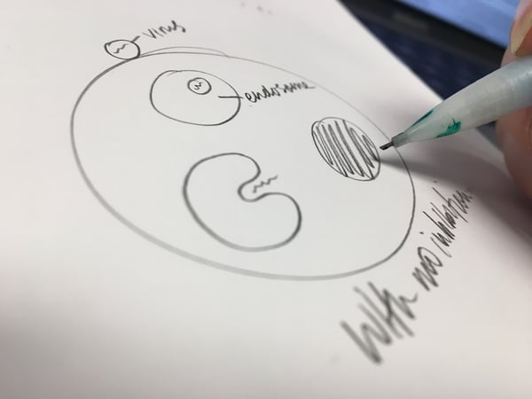
Sketch out your primary findings and have a colleague (or better yet, somebody who is unfamiliar with your research) try and follow the narrative. Use their feedback to identify trouble spots, then go back to the drawing board!
Take (some) shortcuts! Use tools that eliminate the tedious legwork without sacrificing quality.
One such tool is BioRender, a plug-and-play graphics software that contains a library of premade life-science icons that you can use to build custom schematic figures. The online app even contains image templates for commonly-used visual schemas in life sciences (such as cell signaling pathways) that you can use as a starting point for your figures. The best part: both the icons and templates are created by trained scientific illustrators, which means you also don’t have to spend any time confirming the accuracy of their graphics. (Disclaimer: I work for BioRender, but I also love the tool and believe it solves a real need!)
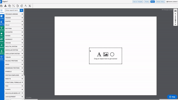
BioRender, a “plug-and-play” online app for creating easy scientific schematic figures.
Using tools with pre-made elements like this can be pivotal in helping you cut out hours of unnecessary legwork while ensuring your figures look professional.
Go forth and illustrate…
If I’ve learned one thing from both my training as a scientific illustrator and my many conversations with researchers, it’s that scientific images aren’t just “pretty pictures”: they truly can mean the difference between confusion and clarity. A good image in the sciences can both teach and inspire, and there are few experiences more rewarding than witnessing someone’s “aha” moment as they scan your illustration and finally understand the science.
A couple of months ago, one of our followers tweeted at us, citing the power of images in science, and I don’t think I could have said it better myself:
"Love love love love love this! So much power in a well-done illustration. Like suddenly the concepts just kind of 'click' and then BOOM a science-lover is born!"
— Booky_McReaderpants (@FeloniousButt) March 13, 2018
So don’t underestimate the power of the picture; who knows, your next illustration may be the spark that sets off that next “boom”!
1https://hilt.harvard.edu/blog/principles-multimedia-learning-richard-e-mayer
2Merieb, E. N. & Hoehn, K. (2007). Human Anatomy & Physiology 7th Edition, Pearson International Edition.
3Lester, P. M. (2006). Syntactic Theory of Visual Communication.
4http://ihpi.umich.edu/news/scientists-take-twitter-new-study-shows-power-%E2%80%9Cvisual-abstract%E2%80%9D-graphics-share-results
Share this:

Savanna Jackson
Savanna Jackson earned her master’s degree in Biomedical Communications from the University of Toronto after studying biology at McGill University. She is now working as a UX Researcher and Science Communications specialist at BioRender. If you have questions about BioRender, SciComm or want tips on creating beautiful illustrations, reach out to me at savanna@biorender.io or follow up on Twitter at @jacksonsassy or @BioRender.